Introduction
A slide framework built for agents.
open-slide is a slide framework for the agent era. You describe a deck in natural language; your coding agent writes the React. open-slide handles the canvas, scaling, navigation, hot reload, present mode, and export so the agent can focus on content.
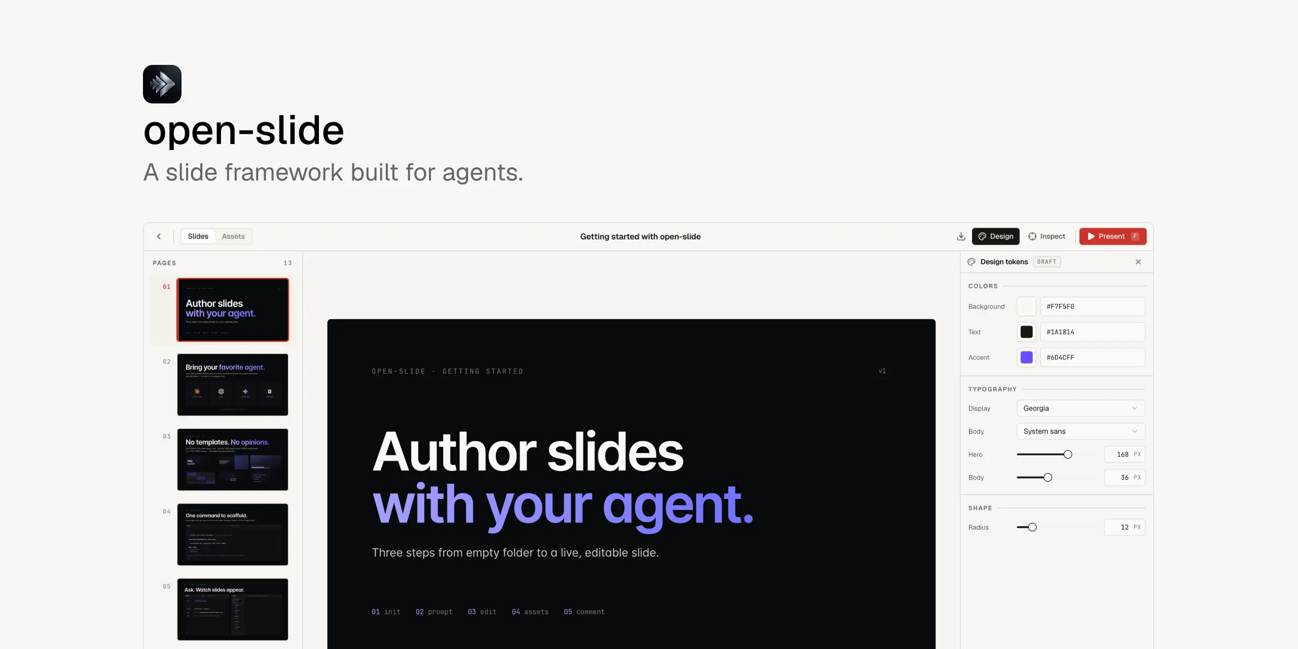
Every page renders into a fixed 1920 × 1080 canvas. Slides are arbitrary React components — not a constrained DSL.
npx @open-slide/cli initWhy open-slide
Slides are visual code. Agents are great at writing code. open-slide is the missing runtime that turns "make slides about X" into a polished, presentable deck — without you ever leaving the chat.
- Agent-native authoring. Ships with skills (
/create-slide,/slide-authoring,/apply-comments,/create-theme) that any Claude Code, Codex, or Cursor session can call. - In-browser inspector. Click any element in the dev server, drop a
@slide-comment, and your agent applies it on the next/apply-comments. - Assets manager + svgl. Drop in images, search 1500+ brand logos through the integrated svgl catalogue.
- Professional present mode. Fullscreen playback, presenter view, speaker notes, timer.
- Export to static HTML or PDF. Self-contained output — share without a server.
A slide is a file
A slide is a React component. The runtime renders one component at a time onto a fixed 1920×1080 canvas, scales it to fit the viewport, and hands you the navigation, hot reload, and present mode.
Each deck lives under slides/<kebab-case-id>/. The entry is
slides/<id>/index.tsx. Assets sit alongside in slides/<id>/assets/.
import type { Page, SlideMeta } from '@open-slide/core';

const Cover: Page = () => (
  <div style={{ width: '100%', height: '100%', background: '#08090a', color: '#f7f8f8' }}>
    <h1 style={{ fontSize: 188, letterSpacing: '-0.04em' }}>
      Hello, <em style={{ color: '#7170ff' }}>open-slide</em>.
    </h1>
  </div>
);

export const meta: SlideMeta = { title: 'Getting started', theme: 'corporate' };
export default [Cover] satisfies Page[];
Two rules: the default export is an array of components (one per page), and
each component fills its container (width: '100%' / height: '100%'). No
DSL, no markdown chain — if you can build it in React, it's a slide.
The 1920 × 1080 canvas
Every page renders into a fixed 1920×1080 box. The runtime scales that box uniformly to fit the viewport, so the same slide looks identical on a phone, a 4K monitor, and a beamer.
Fixed canvas + uniform scaling means every pixel coordinate you write is the coordinate that ships — preview, stage, and exported PDF stay in lockstep. The constants are exported if you need them:
import { CANVAS_WIDTH, CANVAS_HEIGHT } from '@open-slide/core';
// 1920 × 1080
Inside a page, two layout patterns work well: absolute coordinates
(position: absolute + pixel values — predictable, easy for an agent to
write) and flex/grid centring for content that flows. Avoid responsive
breakpoints; the canvas is fixed. Container queries (containerType: 'inline-size' + cqw units) are a useful middle ground for reusable
widgets.